Stuck Sales? It's Not Marketing—It's Time for UX Improvement.
- Apr 13, 2025
- 5 min read
Updated: May 15, 2025
Ever feel like your sales are quietly slipping away and you're not sure why? You’ve optimized your product, your marketing’s on point… and yet, conversions just aren’t happening. Here’s a spoiler—it’s likely your UX design that’s costing you big time.
And we’re not talking pocket change. According to Forrester (Forrester Research, as cited by Forbes🔗), investing in UX improvement brings in an eye-popping $100 return for every $1 spent. That’s a 9,900% ROI. Still, many businesses ignore UX until it’s too late—when bounce rates are up, cart abandonment is high, and customer loyalty vanishes.
Let’s talk about how to catch the red flags, what’s sabotaging your site, and what you can do about it.
Spotting the UX Red Flags That Hurt Sales
You might not see the problem right away, but your analytics are likely trying to tell you something. Here’s what to watch for:
People Are Bouncing… Fast: If your bounce rate is creeping above 45.68% (the average for ecommerce), it’s a sign something’s off. People are landing on your page, then peacing out without clicking anything.Why? Confusing layouts, slow load times, or poor content. Also, Google factors bounce rate into rankings, so you’re losing SEO juice too.
Cart Abandonment Is Sky-High: The global average is a whopping 70.19% abandonment rate (Baymard Institute🔗), and on mobile it jumps to 85.65%. Top reasons people leave?
48% – extra costs too high
21% – delivery too slow
19% – didn’t trust the site
19% – forced to create an account
18% – checkout too long or complex
Just improving your checkout UX could lift conversion rates by over 35%.
Time on Site Is Shrinking: If people aren’t sticking around, it means they’re not finding what they need. Less engagement = lower conversions. When time on site drops, it’s often due to poor content, slow load times, or clunky navigation.
Negative Feedback Is Piling Up: Ever seen repetitive user complaints like “I can’t find X” or “This page is confusing”? That’s real-time feedback screaming for UX improvement. In fact, 88% of shoppers admit they’ve abandoned a purchase due to a bad experience (As cited by HubSpot🔗).
⚠️ Common UX Design Flaws That Kill Sales
Here’s where things usually go wrong:
🚫 Confusing Navigation: If users can’t find what they’re looking for within a few clicks, they’re gone. 61% of users say poor navigation drives them nuts. Keep main menus to 3–7 items max, and avoid deep, hidden links.
🐢 Slow Load Times: Users today expect pages to load in under two seconds—and they're not willing to wait. According to HubSpot🔗, even a one-second delay in load time can lead to a 7% drop in conversions. In the B2B world, the stakes are even higher: 66% of B2B buyers say they won’t return to a site that loads slowly. That’s not just poor performance. That’s poor user experience—and it directly impacts your bottom line.
😵💫 Complicated Checkouts: If your checkout feels like filing taxes, people will bounce. The ideal flow has 7–8 fields max, but many sites ask for 12+. Keep it clean and quick.
📱 Poor Mobile Experience: With over 60% of web traffic coming from mobile (Statista🔗), mobile-first is a must. Mobile pages load 70% slower than desktop ones, and 62% of users say they wouldn’t buy from a site with a clunky mobile interface.
🧪 Time for a UX Audit (Yes, You Need One)
If you’re serious about boosting sales, you’ll need to dig in and audit your UX. Here’s how:
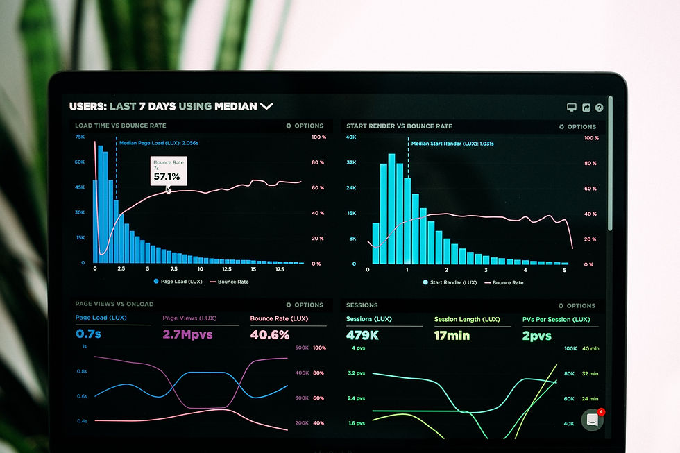
🧭 Map the Customer Journey: Understand how users interact with your site from start to finish. Tools like Hotjar or FullStory can show where people drop off. It’s like reading your customers' minds in heatmaps.
🔍 Click + Scroll Tracking: Click maps tell you where users are engaging most. Scroll maps show if users are even reaching your CTA. If everyone drops off halfway down the page, maybe your content’s too long—or your CTA’s hiding in no-man’s land.
🆚 Benchmark Against Competitors: See how your UX stacks up against top players in your industry. What are they doing better? Learn and adapt.
👀 Run Usability Tests: A/B test your pages. Use eye-tracking or just old-fashioned user interviews. Ask customers: “What frustrated you most?”You’ll be surprised how much they’re willing to share if you ask.
🎯 Building Your UX Improvement Plan
Now that you’ve got the insights, it’s time to act. Here’s how to make your UX improvement plan count:
✅ Start with High-Impact Fixes: Use the RICE Method (Reach, Impact, Confidence, Effort) to pick what to fix first. Focus on the checkout, load speeds, and navigation before tweaking fonts or button colors.
📊 Set Measurable Goals: Don’t just “improve UX”—make it specific. Like:
Decrease bounce rate from 60% → 45% in 60 days
Reduce checkout steps from 12 → 7 by next sprint
Improve mobile load speed by 30%
🤝 Allocate the Right Team: Involve designers, devs, and marketers early. UX is a team sport. And invest upfront in testing—you’ll save more later.
📆 Timeline It Out: A proper UX revamp takes around 3 months. Phase it:
Discovery (2–3 weeks)
Design (3–4 weeks)
Testing (2–3 weeks)
Development (4–6 weeks)…Then rinse and repeat. Because UX improvement is a continuous loop, not a one-time fix.
💡 How Desion Sync Can Help You Win at UX Improvement
At Desion Sync, we specialize in turning underperforming websites into high-converting user experiences. Whether you're losing sales due to poor navigation, long checkouts, or slow mobile performance—we’ll spot the leaks and fix them.
Our UX strategists, designers, and analysts work with you to:
Audit your current experience
Identify low-hanging wins
Prototype and test new flows
Launch and track ROI-driven updates


